Film Cover
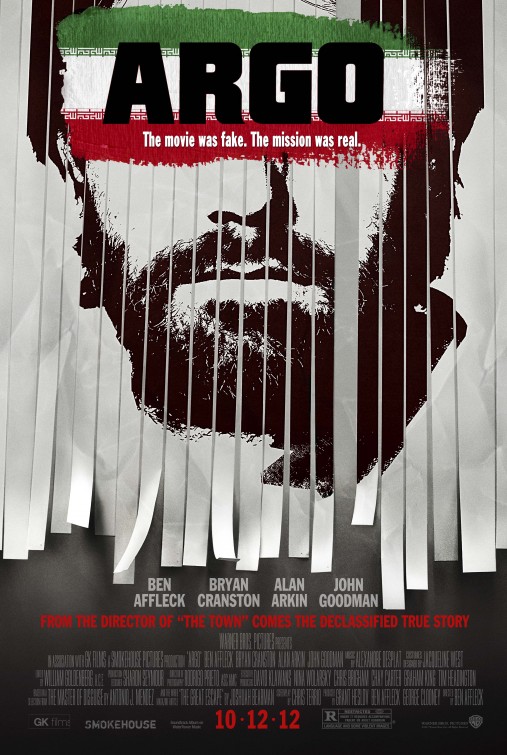
Argo: The use of shredded paper was to hide or conceal information or identity which is fitting as this poster is for a movie about an undercover mission, implying that pieces needed to be put together in order to catch the target.
The covering of the eyes adds to the mystery and the concealing of identity.
The general feel of the poster is similar to that of a wanted poster, the use of black and white adds to this feel.
The Croods: The use of vibrant, saturated colours appeals to the target market of children as it jumps out and catches their attention. The use of distant images and depth gives hints towards a journey or adventure, this is further enhanced by the use of aerial perspective. The title itself is in a rock like font conveying that this movie is set in the stone ages. As well as the vibrant colours they further reach out to the target market of children through the inclusion of animals, displayed on both sides of the poster are colourful creatures, some looking menacing which implies there is an element of danger throughout this movie.
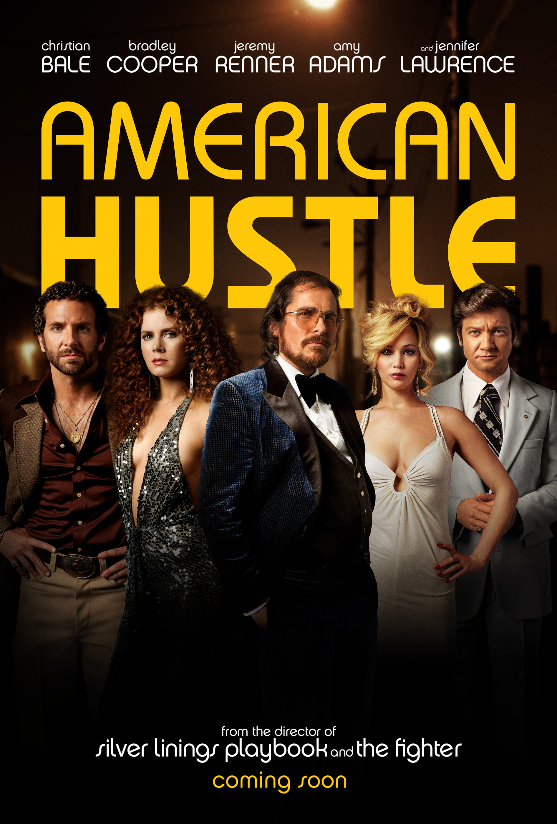
American Hustle: The use of colour were chosen to represent the 'classy' and 'rich' theme of casinos based in the 1960's. The title including the word 'Hustle' immediately implies that his film revolves mainly around crime. The typography used is also very large and bold, being the colour gold and also having the word hustle infers that a large sum of money is a vocal point in this film.
Apocalypto: This movie was based on the mass murder caused by religious sacrifice in south america. The use of the 'C' in title causing an eclipse hints towards the very reason for why all the sacrifice occurred.
The use of dark colours and the foggy weather was used to convey the element of death, The overall message being with darkness from the eclipse comes death.

 |


