Psychedelic poster art
Wes Wilson
Wes Wilson is known for designing psychedelic posters during the 1960's, creating a font that had the illusion of melting or moving, this psychedelic style was very popular during the period of time and had links to the peace movement.
The posters themselves use a very limited pallet of colours, no more than 3, these vibrant colours contrast against each other to bring the text forward they also create a bright poster to add to the psychedelic nature. Wilson's use of font makes it very difficult to read due to the wavy shapes and morphing of the letters, the audience would have to study the image thoroughly in order to read the message, however this was precisely its purpose as a lot of these posters advertised events for a certain social group, so there was an element of exclusivity in his work.
Wednesday, 11 June 2014
Sunday, 1 June 2014
Andy Warhol
Born on August 6th 1928 in Pennsylvania, he graduated high school in 1945 where he then moved on to study commercial art at the Carnegie institute of Technology. After that he moved to New York to start a career in magazine illustrations and advertising.
Warhol first started gaining attention for his ink drawings of shoe advertisements this led to RCA records hiring Warhol to design album covers for them.
Chuck Close
Born on July 5th, 1940 in Washington, most of his early works were large scale portraits based off photographs. Throughout his career he has learned to add to his artistic arsenal in order to create his own distinct style of portrait paintings.
Although over the years his style has changed somewhat the technique is still the same, as he will grid every photo he copies and copies section by section.
Close suffers from prosopagnosia which means he is not able to recognise faces easily, and it was later in his career when he started to wonder why he was always drawn to portraits when he realised that subconsciously it was because it helped him to remember faces.
Later in his life in 1988 a spinal artery collapse left him severely paralysed and bound to a wheelchair, however this only slightly dented his career as he went on to take a greater interest in the photographic side of portraits.
Personally I really like Chuck Close's portraits, I like the bright and vivid colours used in each painting they bring a sense of liveliness to the piece.
The grid method is also a great way of breaking up the composition, having many different segments coloured but together creating an accurate portrait. By creating all these different segments he is able to add emphasis to the shaded areas, this technique is also effective because it creates texture adding more life to the painting.
Francis Bacon
Born on the 28th October 1909 in a nursing home in Dublin, Bacons early life was rough and not easy to deal with, after leaving education and being kicked out of his home by his father after a strange incident. He then moved to London and resorted to theft in order to get by after being fired from multiple jobs, he then found himself in Soho drifting through 'Londons homosexual underworld'.
He returned to london in 1928 after spending time in Berlin and Paris to pursue a career in interior design.
Crucifixion was his first painting to gain real attention, however a lot of this reception was negative and this caused Bacon to stop painting for almost 10 years and caused him to destroy a lot of his early works.
It wasn't until 1944 till Bacon started seeing success from his paintings, but from this point on he was known for his graphic and emotionally raw style.
Personally I find Francis Bacons work a bit disturbing, all of his pieces seem to be dark and sinister, they never have a sense of happiness or joy and although this is likely to be caused by his troubled past the paintings remind me of something out of a horror scene.
Although his portraits don't carry that same serial killer atmosphere I'm still not a fan of them, its evident that they emotions being conveyed through them are ones of suffering and depression but its hard to gauge the facial expressions of the people in them, due to the morphing of their faces, so in my self portrait in the style of Bacon I didn't morph the face so much
Bacon uses the colours in the photos to show the emotions, solid colours used for the background and washed out pale colours for the face.
He creates a stretched effect on the face using longer brush strokes, and the use of white looks as though he's used chalk on the face.
Wednesday, 21 May 2014
Wilkinson Eyre
Wilkinson Eyre architects are known for being one of the top architecture organisation in the country, but are predominantly based in London. It all began when Chris Wilkinson, who had already set up Chris Wilkinson architects joined forces with Jim Eyre in 1987. Over its many successful years it has produced work for a variety of different markets including leisure, retail, educational, industrial, large scale master planning and many more. Producing extraordinary work all over the world, from Sydney to Newcastle, building architectural masterpieces. My favourite examples are as follows: The buttefly bridge, The Forthside bridge, the famous Gateside Millennium bridge, Hulme bridge, Lockmeadow footbridge, Metsovitikos bridge, Paradise street bridge, Peace bridge, Poole harbour bridge, Royal ballet school bridge, South Quay footbridge, and my personal favourite the Tensegrity bridge.
Wilkinson Eyre architects are known for being one of the top architecture organisation in the country, but are predominantly based in London. It all began when Chris Wilkinson, who had already set up Chris Wilkinson architects joined forces with Jim Eyre in 1987. Over its many successful years it has produced work for a variety of different markets including leisure, retail, educational, industrial, large scale master planning and many more. Producing extraordinary work all over the world, from Sydney to Newcastle, building architectural masterpieces. My favourite examples are as follows: The buttefly bridge, The Forthside bridge, the famous Gateside Millennium bridge, Hulme bridge, Lockmeadow footbridge, Metsovitikos bridge, Paradise street bridge, Peace bridge, Poole harbour bridge, Royal ballet school bridge, South Quay footbridge, and my personal favourite the Tensegrity bridge.
Painting Project evaluation
During this project we looked at a lot of different artists that heavily influenced the art world that we know, and how the era they lived in might have influenced them to be different in the paintings.
My first presented with the assignment brief I was excited and looked forward to exploring the different styles that can be achieved through using emotion and morphing the human face.
The techniques I used varied depending on the piece I was working on, as the styles of the artists we looked at differed. When working of the Van Gogh transcript I looked closely at his work in order to recreate his style effectively, studying his brush strokes to get the same effect on the skin. This helped me in my expressionist painting, as I learnt that accuracy to real life is not necessary when conveying emotion, and that the use of colour and facial expressions are the most effective way of getting your point across. When it came to Francis Bacon and looking at David Hockney, I had to look at the way they morphed and manipulated the face in order to portray emotion.
I worked with both water colours and acrylic paints during this project, and found that both were suited better for different pieces, for instance I used water colours for the cubism piece and acrylics for the francis bacon and chuck close style paintings. I felt as though using water colours would create a lighter overall colour and tone to the painting, this is because the photo I was working from was quite light and the David Hockney photos I was looking through were all generally quite light, therefore a lighter washed out paint such as water colours was more suited in my opinion. When working on the Francis Bacon and Chuck Close I felt as though acrylic would be better suited as their paintings contain thicker and more blocked colours.
The most successful aspect of this assignment was learning that painting does not have to as close as possible to real life, that in a sense it needs to be slightly different in order to differ between the ever growing photography. This revelation helped me a great deal as I used to always try and have my drawings/painting as accurate to real life as possible, whereas now I can focus on giving it my own style and focus more on the message in conveying.
Tuesday, 11 March 2014
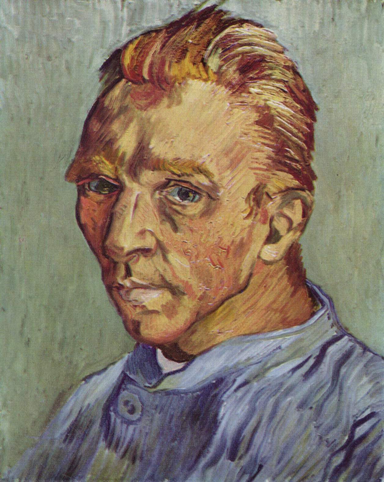
Van Gogh was born on the 30th march 1853 and was a post impressionist painter, his self portraits mainly conveying strong senses of emotion, not only through the expressions used, but also the colours and brush strokes. Due to Van Gogh battling severe depression and anxiety most of the portraits convey moods of sadness, which is shown very effectively through the way he manipulates the paint through his brush. He uses many short brush strokes to create texture and tonal values throughout the face, as opposed to using long strokes. This style of painting can be seen in almost all of his self portraits and although it may not be accurate to real life, this unique style of many brush strokes allows Van Gogh to recreate the emotions felt in real life in his paintings. The consistency of paint stays constant throughout the paintings as does the brush strokes, the way in which he creates such an effective piece of art work using only little brush strokes is extraordinary. The composition itself is fairly basic being a portrait, but being at eye level helps portray the depression and sadness as his dull, somewhat hopeless eyes glare out of the painting. The distribution of shade is interesting and also adds to the emotive features of his work, because in a lot of his portraits areas of his face are shaded, possibly conveying that he is in a dark stage of his life at the time. Van Gogh went through some very depressing times during his life, so much so that at one point after relations with this girlfriend ended, he cut off a bit of his ear and sent it to her. And after a while the stresses of life grew too much for him and he sadly ended his own life in 1890. 
Monday, 10 February 2014
Downtons work is very easy on the eye, he is able to divert the attention of his work to certain facial features of the girls he works with. His use of ink allows him to capture great detail within the face and create different shades throughout the whole piece. 
David Downton
Born in Kent in 1959, Downton pursued a career in the illustration department, studying at both Canterbury and Wolverhampton during 1977-1981. His career finally picked up in 1984 when he moved to Brighton where he worked on a number of different projects including illustrating books and working in advertisement. After working for the financial times in 1996 he rooted himself as being known as a fashion illustrator,and has produced work for the biggest name in fashion including Tiffany & co, Bloomingdales, Chanel, Dior, Vogue
and many others.
Subscribe to:
Comments (Atom)